← Brand Identity Portfolio Brand Identity · Industrial

Java Pipes & Tubes
Brand Identity

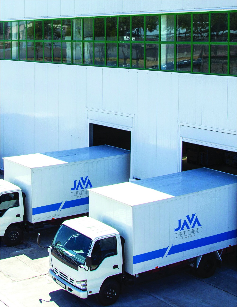
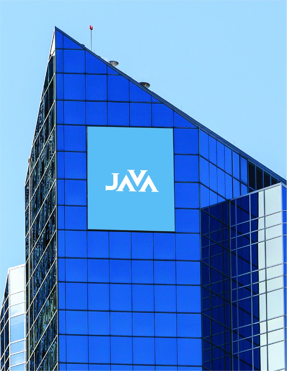
A logo shaped like a pipe — standing out in a commoditised market through a strong, instantly recognisable identity. Est. 1973.

Logo DesignBrand IdentityIndustrialHeritage Brand
Java Pipes & Tubes

The Brief

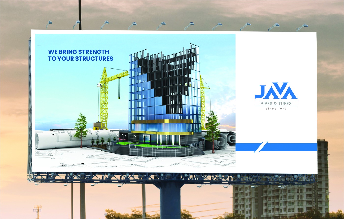
Java Pipes & Tubes has been in the pipes and tubes industry since 1973. A heritage brand in a commoditised market — where most competitors look identical — they needed an identity that stood out while honouring their decades of experience.

Our Approach

  • Created a logo mark that literally references their product — the letterform is shaped like a cross-section of a pipe, creating an instantly recognisable and highly distinctive symbol
  • Built a confident, industrial colour palette that communicates strength and durability
  • Designed stationery and brand applications suited to B2B industrial contexts — business cards, letterheads and vehicle branding
  • Ensured the mark works at all sizes — from business card to building signage

The Result

A brand identity that finally matches the stature of a 50-year-old business — distinctive, confident and immediately communicating what they do.

What We Delivered

Project Deliverables

🎨
Logo Design
🎨
Colour System
💼
Stationery
📐
Brand Guidelines
📱
Digital Assets
🏭
Industrial Applications

Need a brand that stands out
in your industry?

We build identities that make businesses memorable — even in commoditised markets.

Start a Branding Project → More Work